Airy table by Cecilie Manz for Muuto


Cecilie Manz is one of the leading designers in the Scandinavian scene  furniture, working on both products mainly for the home as well as producing experimental prototypes ( her Lots of Paper stool-sculpture is a true inspiration to me).

Recently, she designed a new coffee table for Danish brand Muuto that will be launched at Maison et Objet 2014 next September. Airy table is conceived as a flexible piece able to adapt to any sort of interior or functions. The name reflects the light appearance of its a metal frame that is welded and soldered very accurately to create a light and skinny silhouette. The polished plywood top, accurately finished, adds the necessary personality to the piece.


 The table comes in four different shapes and colours: black, grey, off-white and oregon pine and expresses its best when the different tables are combined together.


All pictures via MUUTO, with thanks.

Studio Oink for BastisRIKE


As you well know, I particularly appreciate the work of German Studio Oink ( see previous post here) and this time I like it even more. Their latest work is the styling for a new series of products designed by Henrike Schoen of BastisRIKE among which the beautiful black and white graphic blanket stands out amazingly.

BastisRIKE is a Siegburg-based studio dedicated to the creation of stamps, paper products, textiles and other interior products. Handmade philosophy and sustainability is the core of its designs as mirrored in the attention to details and the choice of environmental friendly materials.


To me, the blanket is outstanding. The pattern derives from a postcard Henrike Schoen designed earlier that is called NETZ, meaning network in German. I believe the pattern works even better in such a scale, reminding me of some modern, quirk transposition of the Beni Ourain rugs we see so much lately.
 

I cannot but agree with Wendy of Beeldsteil - where I spotted the blanket yesterday - and say this has definitely entered my winter wishlist.

All images via Studio Oink, with thanks.

Plywood interiors in Melbourne


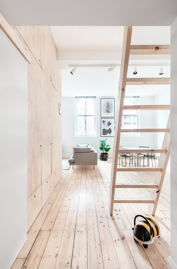
This project by Clare Cousins Architects exemplifies how conceptual design thinking can transform our way of visualizing a space. In fact, the 75 sq apartment had to be transformed from a one bedroom space to one able to host a growing family. Taking inspiration from traditional Japanese interiors, the architects re-designed the program of the space by opting to minimize the bedroom areas. Two micro rooms were created, with the master bedroom conceived as a cocoon made of plywood. The room is separated only by sliding doors to maximise the living and family spaces. 
Plywood is used extensively throughout the whole apartment helping to enhance the perception of the space as a whole. Moreover, it is the perfect choice to fit the low budget the architects had to work with: the material is affordable and readily available. 

Photographs: Lisbeth Grosmann


Via Archdaily

GIVEAWAY | Have you already joined?


Have you joined One Must Dash giveaway that is running on the blog now? Take a chance to win one of the lovely Not Another Bag, just check the post here to know how to enter!
Quirky moments to live and wear. 

This competition is opened until the 1st of September.

Good luck!


All images © One Must Dash

Fantastic white apartment in Sweden


As we are still on holidays and will be back in Barcelona next week, I didn't manage to get any new shots from home. But I thought it would be nice to share with you this apartment I spotted on Fantastic Frank Stockholm selection recently: it's all about whiteness and greenery, just what I want for our place! Fantastic Frank projects have been always a lovely source of real life inspiration: every time you see one of their shots you just to take the detail back to your place. This time is hard to choose for me as I'm equally in love with the 10x10 tile wall, the white floors and the distribution of the areas. Too many things it's would be just easier to move in!


All images © Fantastic Frank Stockholm

Check all Fantastic Frank projects here.

GIVEAWAY | ONE MUST DASH | The Not Another Bag


One Must Dash is a Swedish/English studio run by Anki Josefsson and Anneli Sandström, based in both Sweden (Gothenburg) and UK(Brighton) that celebrates quirky moments in everyday life, in black and white (mostly). I have been a big fan of their prints for a while now: who is not in love with their Small Talk print? It has become almost an icon for all the lovers of monochromatic home details.
 

And it's giveaway time!
Today I teamed up with One Must Dash to offer you one of their "The Not Another Bag", a very large black and grey printed canvas bag with lining. The idea of the bag drives its inspiration from envelopes as you can see in the pictures here. Handles made from finest vegetable-tanned Italian leather and is beautiful to wear.


To have the chance to win their Not Another Bag, just follow these steps:
1.  follow them on Twitter @onemustdashshop or like them on FB ONE MUST DASH
2. Tell me in the comments below what you would put inside your Not Another Bag.
This competition is opened until the 1st of September.

The giveaway is now closed. The winner will be announced here soon!


All images © One Must Dash

WEEKEND SPECIAL | A home in Finland


This is probably the most beautiful under construction home I have seen lately. It belongs to Maja, the Finnish blogger behind Musta Ovi. 
In her blog, Maja have been documenting all the construction process, from the very beginning to the finishing touches. I find her home beautiful and it is also a perfect example of how concrete, if used wisely and with talent, doe not turn to be a cold element in the interior.


The kitchen is all white: this choice underlines even more the presence of  the 265 lamp by Paolo Rizzatto for Flos. The bedroom is essential in a perfect Finnish way and has an unbeatable view. 
 

All images via Musta Ovi


An holiday apartment in Barcelona


I stumbled upon the latest CaSA project for a holiday home in Barcelona. The studio is well known for the so called White Retreat, an essential space of light and whiteness that could be the dream home of any minimalist. With this flat, the duo embrace a more Mediterranean approach to the interior: the inner space, created by the juxtaposing of white surface and a grey micro-cement floor, contrasts with the warm, terracotta colours of the terrace.


A series of custom-made white tubes structures have been used throughout the whole space to create several elements, like the entrance screen above or the table and bar area in the kitchen. 


To know more about the flat, please visit the link HERE.


Our Home #7 | String Pocket love


My love for String System is well documented across the blog since its beginning. The bookshelves have been on my home wish list since I can remember I had one and I was very happy when the RAW String Pocket arrived at home last year. I saw it for the very first time thanks to the images Lotta Agaton published from her collaboration with the Swedish brand and I knew that new version had to be part of our place.


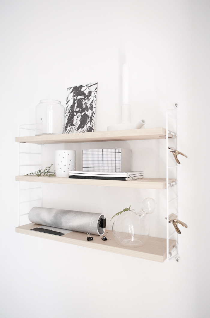
At the moment, the versatile bookshelf is placed in our home studio, just above my place. I love to style it from time to time with small objects and things I find during our walk around, especially with leaves and greenery. The touch of the shelves is very special, warm and almost sensual. Though String pocket has been introduced only in 2005 to provide a smaller and more flexible shelving solution, it has now become a fundamental part of the brand product range.  The kit consists of two panels and three shelves therefore, thanks to its special system, by adding just another kit will allow you to create many different solution, both horizontally and vertically.


As we need some extra storage space, I am considering of adding a FLOOR String System either in the living area or in the kitchen: a pity the raw version is not available for the big ones! I will keep you posted about the choice and would love to know your ideas about your favourite shelving systems!

All pictures © facing north with gracia


KOTO by Skandinavisk x Design Bloggers United


I am still on holidays but really wanted to share with you the big news about the launch of our scented candle at Formex fair in Stockholm this week! KOTO by Skandinavisk x Design Bloggers United is the result of an exclusive collaboration between our bloggers group and  Skandinavisk, a brand well known for its gorgeous work with fragrances that celebrate the unique Scandinavian lifestyle. You probably remember when I talked abouth them HERE, so you can imagine how exciting it was to work with them to create KOTO


Named after an old Finnish word that means home, the scented candle talks about cosy, intimate spaces where to refresh the soul, refuges from long winters. It embraces the renowned simplicity and elegance of Scandinavian homes with its black and white look and with its soft notes of mandarin, jasmine, vanilla and amber helps our quest for tranquillity and calm atmospheres. To ensure this, KOTO has been created as an extremely long-lasting candle: it is bigger than regular candles as it burns up to 75 hours. Burn the four wicks all together until the melted wax reaches the edges of the glass and let the fragrance embrace you.
The candle will be available in several stores across Europe at the beginning of September but can be pre-ordered already at Skandinavisk.


The KOTO by Skandinavisk x Design Bloggers United collaboration marks also the entrance to our group of talented Susanna Vento, who created the styling you see in this post. 
Welcome Susanna!

Our home #6 | Still life in the studio


We are now in the Alps for the first part of our summer holidays with the Italian side of our family. The weather is not so good this summer but we still hope to do some nice walks up and down the mountains.

I took these shots at home before leaving for our summer holidays and I thought it was nice to post them on the blog, just to keep it updated with something fresh. The pictures were taken in our studio, you can see more pictures of it here. The still life was created with three of the Calabasse vases from Serax and a pile of Kinfolk magazines. Very simple and minimal.


All pictures © facing north with gracia